Hanging Masterpieces: How to Style Fine Art in Your Living Room
In short: Elevate your living space by hanging art at eye level, matching its scale to your sofa (aim for two-thirds of its width), and creating a tonal dialogue between your frames and furniture.
The Living Room Canvas
The living room is more than just a gathering space; it is the visual narrative of your home. It is where your taste, your travels, and your quiet moments converge. Bringing museum-quality fine art into this central room is not merely about filling empty wall space. It is about creating an atmosphere. When done thoughtfully, a single striking image can anchor the entire room, establishing a sense of history, depth, and quiet sophistication.
To achieve this, we must look at the room the way a curator looks at a gallery. It is a delicate dance of scale, light, and conversation between the objects on the floor and the masterworks on the walls.
The Geometry of Placement and Scale
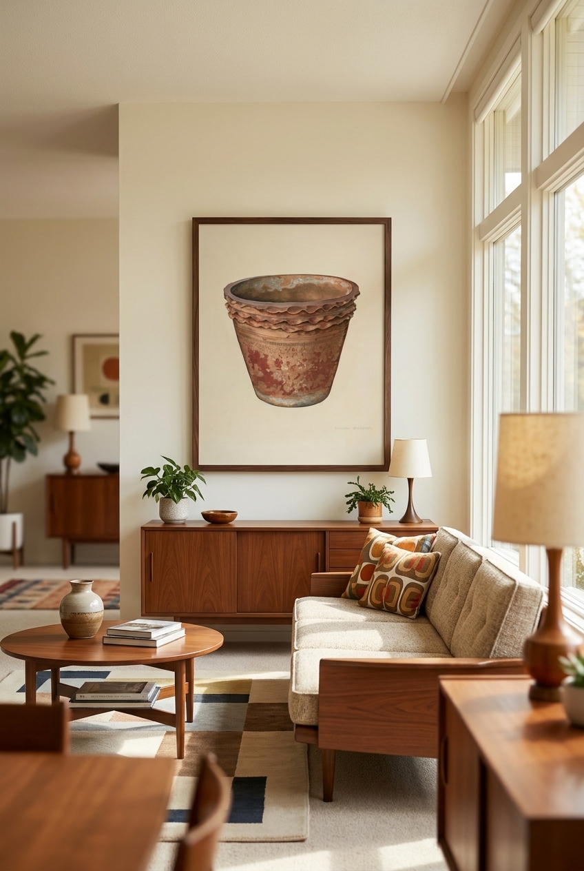
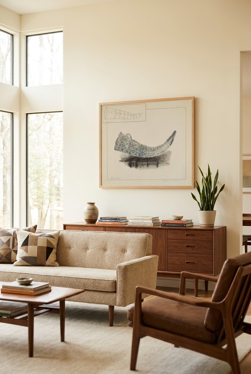
The most common misstep in styling living room art is scale. A small print floating on a vast wall above a generous sofa can feel lost and untethered. As a general rule of thumb, art hung above a sofa or console should span approximately two-thirds to three-quarters of the furniture's total width. This creates a balanced visual anchor, grounding the seating area rather than letting the artwork drift away. If you have a particularly long sofa, consider a pair of matching vertical prints hung side-by-side to achieve the correct scale.
Height is equally critical. Aim to hang your artwork so that the center of the piece sits at eye level—roughly 57 to 60 inches from the floor. When positioning art directly above a sofa, leave a gap of six to eight inches between the bottom of the frame and the top of the sofa back. This allows the piece to feel connected to the furniture group without feeling crowded. If you hang it too high, the artwork will feel disconnected, floating aimlessly near the ceiling.
Creating a Dialogue with Furniture
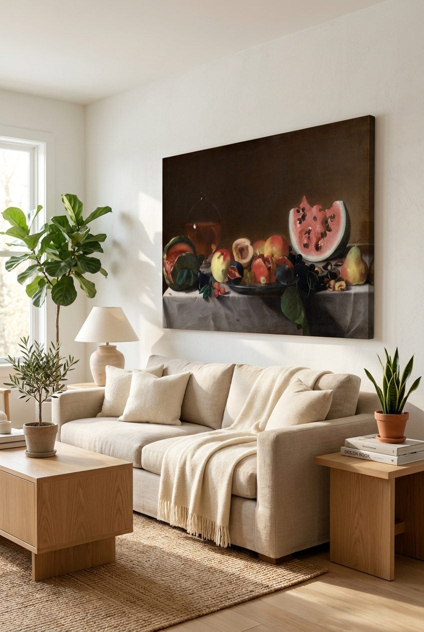
Great interior design relies on unexpected conversations. Your art should not match your cushions perfectly; instead, it should speak to your furniture through shared tones, contrasting textures, or complementary eras. For example, a moody, dramatic Baroque piece like Still Life with Fruit and Carafe thrives when paired with rich velvet upholstery, dark wood finishes, or brass accents, bringing out the deep, amber glow of the oil painting. The rich shadows of the canvas create an intimate, cozy atmosphere perfect for evening conversations.
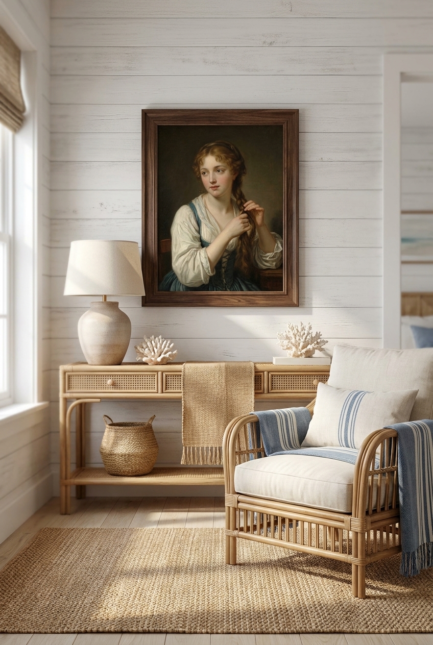
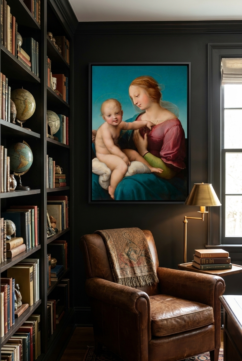
Alternatively, if your living space leans toward the classical or features soft, neutral linens, the luminous colors of The Niccolini-Cowper Madonna can introduce a serene, timeless elegance. The delicate blues and pinks of the Renaissance palette lift a neutral room, adding historical gravitas without overwhelming the space. If you wish to soften a modern, minimalist mantelpiece, a charming eighteenth-century portrait like A Girl with a Flower in Her Hair offers a gentle, human touch that breaks up hard architectural lines and brings a whisper of classical romance to a contemporary home.
The Finishing Touches: Framing and Light
Framing is the bridge between the artwork and your architecture. For a cohesive look, match the wood tones of your frames to other timber elements in the room, such as a coffee table or a side chair. Alternatively, a gilded frame adds a touch of old-world opulence that elevates even the most contemporary setting.
Finally, consider your lighting. Avoid harsh, direct spotlights that cause glare on glass. Instead, opt for warm, indirect lighting. A slim, brass picture light mounted directly above the frame not only illuminates the brushstrokes of your print but also bathes the entire corner of your living room in a warm, inviting gallery glow.
Frequently asked questions
How do I choose between a single large print or a gallery wall?
A single large statement print creates a clean, serene focal point and makes a room feel more spacious and orderly. A gallery wall offers a more eclectic, personal feel but requires careful planning to avoid looking cluttered. For formal living rooms, a single large piece is usually preferred.
Should the frame match my other wooden furniture?
It does not need to be an exact match, but it should belong to the same tonal family. If you have warm oak furniture, a warm wood or gold frame works beautifully. Mixing too many disparate wood tones can make the room feel disjointed.
Can I hang fine art prints near a window?
While modern archival inks and UV-protective acrylic offer excellent resistance to fading, it is always best to avoid placing fine art in direct, harsh sunlight for extended periods to preserve the vividness of the colors over decades.