Harmonizing Color: How to Choose Art That Complements Your Room
In short: Avoid matching your art directly to your walls. Instead, look for shared undertones, complementary contrasts, and framing that bridges the artwork with your furniture.
The Myth of Perfect Matching
One of the most common missteps in interior styling is trying to match the colors of a painting exactly to the colors of a room. When a canvas perfectly mirrors the shade of your sofa or the exact paint on your walls, the art loses its voice. It flattens into decor rather than standing as a window into another world.
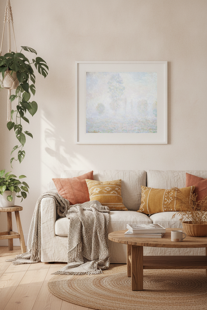
Instead of matching, aim for a dialogue. Art should feel as though it belongs in the space, but also as though it has its own independent life. A room with neutral, plaster-toned walls, for instance, is the perfect host for a piece with soft, shifting atmospheric tones. Consider how the delicate, light-filled blues and soft lavenders of Claude Monet's Morning Haze can introduce a sense of quiet morning air into a minimalist room without overwhelming the existing palette.
Finding the Common Thread
To create a cohesive feel, look for shared undertones rather than identical colors. Every room has a temperature—it is either predominantly warm or cool. Recognizing this temperature is the secret to choosing art that feels effortlessly integrated.
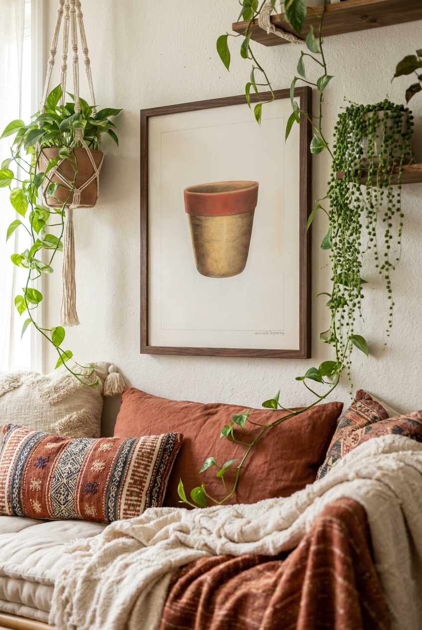
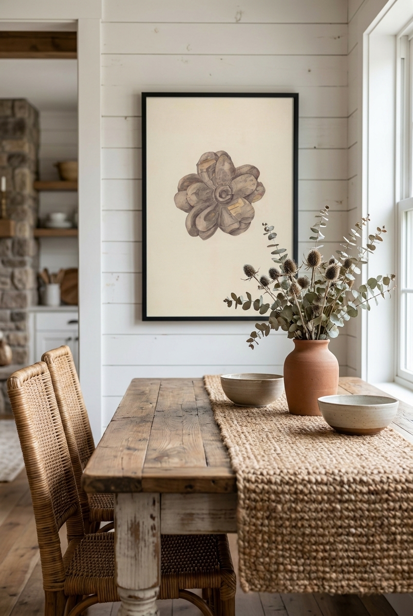
If your space features warm elements—like white oak floorboards, linen curtains, or terracotta tiles—look for artwork that shares those earthy, grounded undertones. The rich, muted ochres and soft clay tones found in Annie B. Johnston's Pottery Flower Pot bring a quiet, rustic warmth that anchors a sunlit kitchen or a cozy reading nook.
Conversely, if your room leans cool—with slate tiles, crisp whites, or deep navy accents—look for art that embraces cool grays, deep greens, or icy blues. This shared temperature creates an invisible thread that ties the entire room together.
The Power of Contrast and Balance
While harmony is beautiful, a room entirely composed of matching tones can feel sleepy. Sometimes, the most sophisticated choice is deliberate contrast. A moody, dark painting hung in an otherwise bright, airy room creates an instant, compelling focal point.
For a room dominated by light neutrals, introducing a piece with deep, saturated tones can add much-needed weight and drama. The rich, velvety dark background of Paul Ward's Flower Vase provides a striking counterpoint to pale walls, drawing the eye in and giving the room a sense of history and depth.
When introducing a high-contrast piece, balance is key. Ensure the frame or a small detail within the artwork speaks to another element in the room—such as a dark wood sideboard, a black iron light fixture, or a deep bronze hardware detail.
Scale, Placement, and the Final Touch
Once you have selected a piece that harmonizes with your palette, consider its physical relationship to the room. Scale and placement are just as important as color for making art feel at home.
- The Two-Thirds Rule: When hanging art above a piece of furniture like a sofa or a console, the artwork (or grouping of art) should ideally span about two-thirds the width of the furniture below it.
- Eye-Level Hanging: A common mistake is hanging art too high. The center of the image should hang at roughly eye level—about 145 to 150 centimeters (57 to 60 inches) from the floor.
- Framing as a Bridge: Use your frame to connect the artwork to the room's furniture. A warm walnut frame can instantly ground a cool-toned print in a room filled with mid-century wooden furniture.
Frequently asked questions
Should my art match my throw pillows and rugs?
No. Matching your art too closely to your textiles can make a space feel overly staged and sterile. Instead, look for art that shares a similar mood or has one or two subtle, unexpected accent colors that complement your textiles without mimicking them.
How do I choose a frame color that works with both the art and my walls?
Treat the frame as a bridge. Natural wood tones like oak or walnut are incredibly versatile and work with almost any wall color. A thin black frame adds modern structure, while a gilded frame adds warmth and historical charm. Avoid matching the frame exactly to your wall paint.
Can I hang cool-toned art in a warm-toned room?
Yes, absolutely. This creates a beautiful, sophisticated tension. The key is to ensure the contrast feels intentional. You can achieve this by incorporating one or two small, cool-toned decor pieces—like a ceramic bowl or a linen cushion—elsewhere in the room to balance the artwork.