
The Architectural Line: The Elegant Graphic Art of Imre Reiner
In short: Imre Reiner masterfully bridged classical typography and modern graphic art. His striking black-and-white woodcuts and illustrations bring a poetic, structured elegance to modern homes.
The Master of the Graphic Line
There is a rare kind of artist who can make a single black line feel as structural as a steel beam and as light as a breath of wind. Imre Reiner was one of these rare creators. Born in Hungary at the dawn of the twentieth century, Reiner spent his life bridging two seemingly opposite worlds: the strict, mathematical discipline of classical typography and the expressive freedom of modern graphic art.
To look at Reiner's work is to see a mind deeply in love with the history of the written word. He began his career studying sculpture and graphic design, traveling across Europe to absorb the radical new design movements of the 1920s before settling in Switzerland. He became a world-renowned typeface designer, but he was never content to let letters just sit quietly on a page. He saw the graphic line as a high art form in its own right, bringing an uncompromising structural clarity to everything he touched.
The Dance of Ink and Space
If you look closely at Reiner's wood engravings and calligraphic studies, you will notice a captivating tension. It is a constant, beautiful tug-of-war between absolute control and sudden spontaneity. One moment you are looking at a perfectly balanced, architectural composition; the next, your eye is caught by a fluid, gestural stroke that feels entirely improvised.
This tension is particularly impressive when you consider his medium. Wood engraving is an unforgiving art; every cut into the block is permanent, requiring immense physical control and planning. Yet, Reiner managed to make his woodcuts look as spontaneous as a brushstroke on silk. Working primarily in black and white, he understood that what you leave out of a picture is just as important as what you put in. His compositions are masterclasses in negative space, where the white paper actively presses against the heavy black ink to create a rhythmic, vibrating energy.
A Modernist Eye on Nature
While Reiner is highly celebrated for his abstract and typographic genius, his approach to natural subjects is equally breathtaking. He had a way of stripping away the unnecessary clutter of the natural world to reveal its underlying geometry and spirit. His botanical works are not mere scientific illustrations; they are poetic interpretations of growth, form, and light.
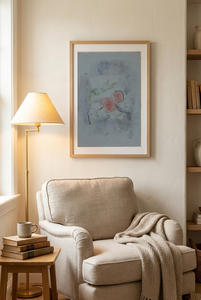
A perfect example of this is his stunning piece, Flowers (1932). In this work, Reiner coaxes incredible depth and emotion out of a simple floral arrangement. The lines are delicate yet confident, capturing the fragile beauty of blossoms alongside the bold, structured energy of modernism. It is a testament to how his classical training could breathe new life into a traditional subject, turning a simple vase of flowers into a profound study of space and rhythm.
Bringing Reiner's Elegance Home
In a modern home, artwork needs to do more than just fill an empty space on a wall; it should set a mood and invite contemplation. Reiner’s work is uniquely suited for contemporary interiors. Because his style relies on intellectual elegance and poetic restraint, his prints never shout for attention. Instead, they quietly command it, offering something new to the viewer with every glance.
Whether displayed as a framed fine-art print in a minimalist living room or as a textured canvas in a study, these pieces bring a sense of architectural sophistication. The clean, graphic quality of his work pairs beautifully with modern furniture, while the organic, hand-carved feel of his woodcuts adds warmth and a human touch to clean-lined spaces. You can explore these timeless designs in our Imre Reiner collection to find the perfect balance of classical structure and modern soul for your own walls.
Frequently asked questions
What makes Imre Reiner's style unique?
Reiner's style is defined by the tension between classical control and modern spontaneity. Trained as a typographer, he brought structural clarity and architectural precision to his expressive, fluid woodcuts and graphic illustrations.
How does his background in typography influence his fine art?
His typographic background gave him a deep appreciation for the graphic line, negative space, and the balance of black and white. He treated visual compositions much like letterforms—focusing on rhythm, proportion, and structural harmony.
Why do Imre Reiner's prints work well in modern home decor?
With their minimalist color palettes, strong graphic lines, and poetic restraint, Reiner's works complement contemporary and mid-century modern interiors beautifully. They offer sophisticated visual interest without overwhelming a room's color scheme.