Why does Classical Tonalism feel so calming?
In short: Classical Tonalism is a late 19th-century art style defined by muted colors, soft light, and a meditative, atmospheric mood. By focusing on harmony over bright contrast, these works bring a deep sense of quiet and sophistication to any room.
What is Classical Tonalism?
If you have ever stood before a painting and felt an immediate, soothing hush wash over you, you have likely experienced Classical Tonalism. Emerging in the late nineteenth century, this understated art movement prioritized mood, atmosphere, and a unified color scheme over dramatic action or bright, contrasting colors.
While the Impressionists were busy chasing the fleeting, fractured glare of midday sun, the Tonalists looked to the quiet hours. They painted landscapes and still lifes wrapped in mist, twilight, or the soft, filtered light of a shaded studio. By using a restricted palette of closely related tones—often soft greys, muted greens, warm browns, and delicate creams—they created works that feel deeply meditative and poetic.
Who Were the Key Figures of the Movement?
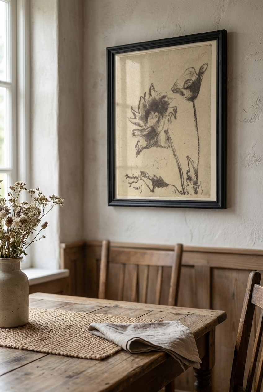
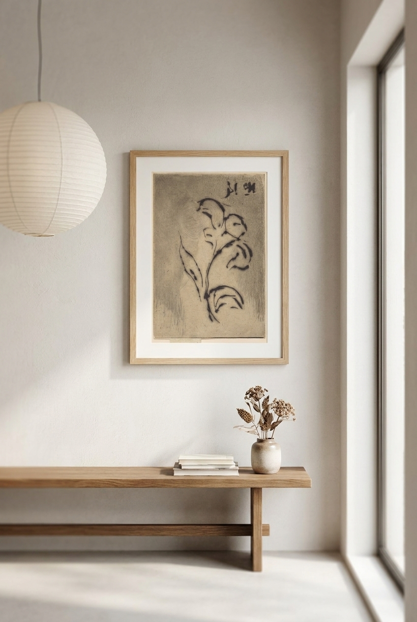
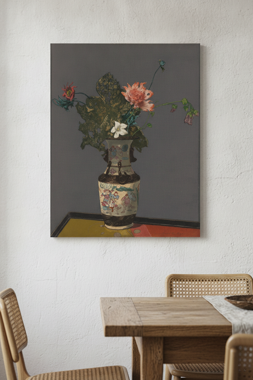
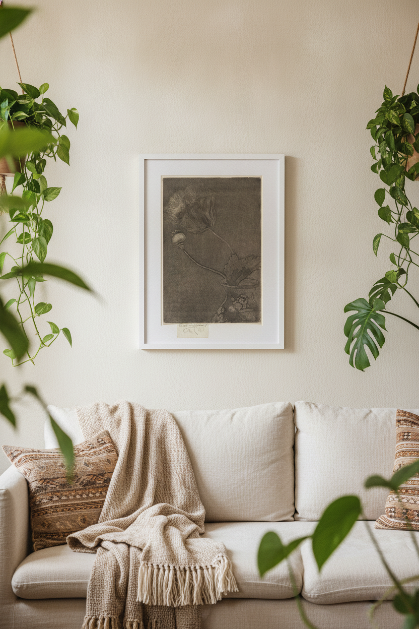
To understand the magic of this style, we have to look at the artists who mastered its subtle language. One of the most fascinating figures was the French-born British artist Théodore Roussel. A close associate of James McNeill Whistler, Roussel brought an exquisite delicacy to his depictions of nature. His work often focused on single botanical subjects, rendered with a sensitive, almost dreamlike precision. For instance, in his print Poppy in a Vase, we see how he strips away unnecessary detail to focus on the soft, drooping form of the flower, bathed in a gentle, atmospheric light. Another stunning example is his Two Flowers, which captures the fragile, fleeting beauty of blossoms with an incredibly subtle color harmony.
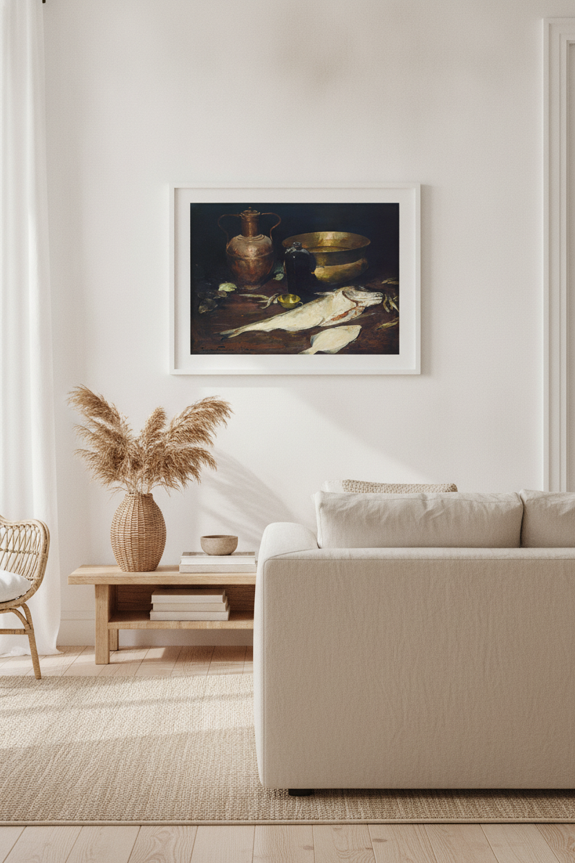
Another giant of the movement was Emil Carlsen, a Danish-born American painter often referred to as the "American Chardin." Carlsen had a rare gift for making the ordinary look extraordinary. In his Still Life with Fish, Carlsen transforms a simple kitchen scene into a study of quiet dignity. The soft, silvery light glides over the scales of the fish and the textured surfaces of the vessels, proving that under the Tonalist eye, even the most humble subjects possess a quiet, spiritual beauty.
How to Recognize a Tonalist Masterpiece
Spotting a Tonalist artwork is less about identifying a specific subject and more about recognizing a distinct feeling. However, there are several key visual hallmarks that define the style:
- A Restricted Palette: Tonalists rarely used pure, unmixed colors. Instead, they relied on a dominant hue—such as a cool blue, a warm amber, or a pearlescent grey—and painted the entire piece within that narrow color family.
- Soft, Lost Edges: You won't find sharp, harsh outlines in these paintings. The edges of objects and landscapes melt gently into the background, mimicking the way our eyes perceive things in low light or fog.
- An Inner Glow: Rather than casting harsh shadows with direct sunlight, Tonalist paintings seem to glow from within. The light source is usually indirect, filtered, or fading.
We see these qualities beautifully combined in Roussel's hauntingly beautiful L'Agonie des Fleurs (The Agony of Flowers). Here, the decaying blossoms are treated not with sadness, but with a quiet, poetic reverence, wrapped in a soft envelope of atmospheric shadow that makes the entire composition feel suspended in time.
How to Choose Tonalist Prints for Your Home
Because Classical Tonalism is built on harmony and restraint, it is one of the most versatile and liveable art styles you can bring into your home. Unlike bold, high-contrast abstract art that demands immediate attention, Tonalist prints whisper rather than shout. They are designed to be lived with, offering a resting place for the eyes and the mind.
These pieces are exceptionally well-suited for spaces where you want to cultivate a sense of peace and focus, such as a bedroom, a home office, or a cozy reading nook. Because their color palettes are so unified, they blend seamlessly with a wide variety of interior styles. They look particularly stunning alongside natural materials like dark wood, raw linen, and matte ceramics, enhancing the organic, tactile feel of a room without overwhelming it.
Frequently asked questions
What is the difference between Impressionism and Tonalism?
While both movements emerged in the late 19th century and focused on light, they had very different goals. Impressionism used bright, unblended colors and quick brushstrokes to capture the fleeting, vibrant effects of outdoor sunlight. Tonalism, on the other hand, used a muted, harmonious palette of closely related colors to create a quiet, moody, and atmospheric indoor or twilight scene.
When did Classical Tonalism begin?
Tonalism flourished primarily from the 1880s through the 1910s. It was heavily influenced by the French Barbizon School and the aesthetic philosophy of artists like James McNeill Whistler, who believed art should prioritize visual harmony and mood over narrative storytelling.
Why are these artworks so effective for home decor?
Tonalist art is incredibly versatile because of its quiet, low-contrast nature. Because the color palettes are restricted and harmonious, these prints do not clash with existing decor. Instead, they bring a sense of warmth, sophistication, and calm to a room, making them perfect for spaces meant for relaxation.