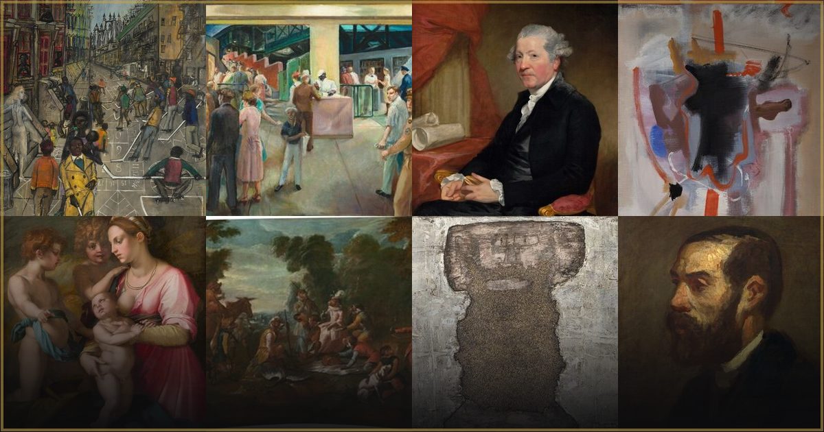
Why does Florence Truelson's art feel so calm?
In short: Florence Truelson rejected the loud abstraction of her era to focus on Classical Realism. Her quiet compositions, gentle light, and earthy tones bring a sense of meditative peace and archival permanence to any modern room.
The Art of Quiet Observation
In a world that constantly demands our attention, the paintings of Florence Truelson offer a rare and welcome invitation to slow down. Truelson was a dedicated practitioner of Classical Realism, an artistic philosophy that honors the rigorous academic traditions of form, composition, and tonal harmony. Her work does not shout for attention with bright colors or frantic brushwork. Instead, it draws the viewer in through a profound, meditative stillness.
The secret to this calm lies in her deliberate, balanced approach to the canvas. While many of her contemporaries embraced the rapid rise of modern abstraction, Truelson looked to the quiet grandeur of classical antiquity and the disciplined draftsmanship of the European academies. By prioritizing order and balance, she created scenes that feel anchored, stable, and deeply comforting. You can explore this serene aesthetic in the complete Florence Truelson collection, which showcases her unique ability to find beauty in silence.
Light, Shadow, and a Restrained Palette
Truelson’s stylistic signature lies in her masterful manipulation of light and shadow, a technique known as chiaroscuro. However, unlike the dramatic, theatrical lighting of Baroque masters, Truelson employed this contrast to carve out a serene, tactile presence. Her shadows are soft and atmospheric, giving everyday objects a tangible weight and three-dimensional reality.
Her color choices further enhance this sense of peace. Truelson worked with a highly restrained and sophisticated palette, favoring:
- Earthy pigments and muted ochres that ground the image in a natural warmth.
- Cool, atmospheric undertones that create a sense of depth and quiet air.
- Soft, diffused illumination that eliminates harsh glare.
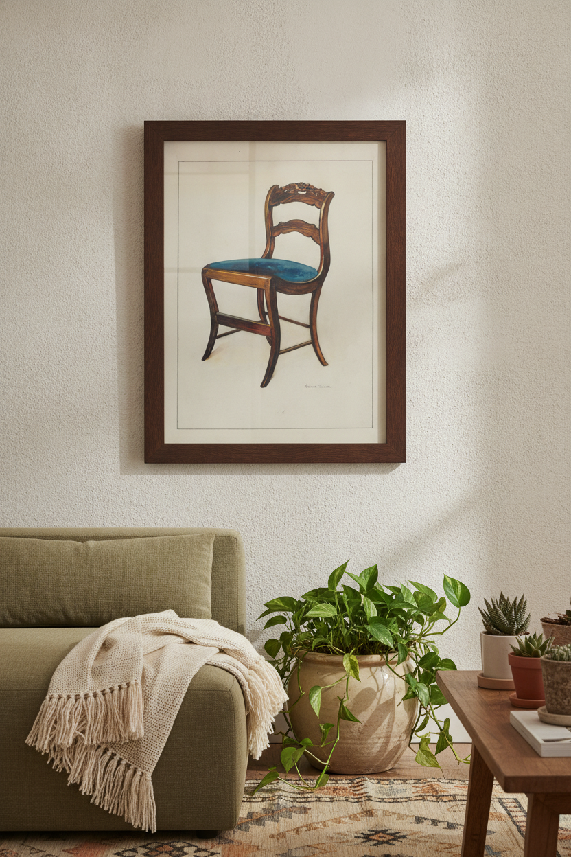
This careful control of color and light is beautifully evident in her detailed studies of everyday objects. A prime example is her rendering of a Mahogany Chair with Card Rose Design on UpperWrung, a piece from around 1937. Here, a simple piece of historic furniture is elevated into a subject of quiet dignity, showcasing her incredible draftsmanship and appreciation for fine craft.
Bringing Academic Elegance into the Modern Home
While Truelson’s techniques are rooted in centuries-old academic traditions, her art feels remarkably at home in contemporary spaces. Modern interior design often prioritizes clean lines, open space, and a sense of sanctuary. Truelson’s paintings complement these design goals perfectly, acting as a visual anchor in a busy household.
Because her palette is dominated by sophisticated neutrals, warm wood tones, and cool grays, her prints blend seamlessly with a variety of decor styles, from minimalist to traditional. Choosing her work as a high-quality canvas or framed print allows you to bring a touch of archival permanence into your daily life. It is art that does not demand anything from you, but simply offers a quiet, beautiful space for your eyes to rest.
Frequently asked questions
What is Classical Realism?
Classical Realism is an artistic movement that values the traditional techniques and standards of the European academies. It emphasizes disciplined draftsmanship, realistic representation, balanced composition, and a mastery of light and form.
When did Florence Truelson create her work?
Florence Truelson was active during the mid-20th century, notably producing detailed documentary and artistic studies in the late 1930s. Her work stands out for maintaining classical academic standards during an era dominated by modern abstraction.
Why are her paintings so well-suited for fine-art prints?
Her sophisticated, restrained palette of earthy ochres, rich wood tones, and cool undertones translates beautifully to high-quality archival paper and canvas. The subtle gradations of her gentle chiaroscuro require museum-grade printing to fully capture their depth.