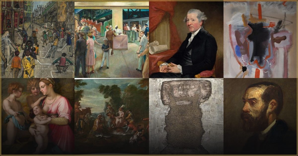
Why does Frank Gutting's quiet realism feel so modern?
In short: Frank Gutting's work combines rigorous classical draftsmanship with a quiet, contemplative stillness. His meticulous attention to detail and harmonious light make his art uniquely grounding for contemporary homes.
The Art of Stillness and Precision
In a world that often feels hurried, fragmented, and loud, the art of Frank Gutting offers a welcome pause. Rooted in the rigorous traditions of classical realism, Gutting’s work captures subjects with a quiet, dignified permanence. He didn't merely paint; he observed with a rare devotion, elevating everyday objects and scenes into the realm of the ideal.
At the heart of his appeal is a timeless pursuit of balance, order, and refined form. Drawing inspiration from the academic masters of the past, Gutting relied on precise draftsmanship and a harmonious distribution of light and shadow. The resulting imagery does not demand your attention with flashy colors or chaotic energy; instead, it invites you in with a gentle, contemplative stillness that feels incredibly grounding.
The Magic of Meticulous Detail
What makes Gutting's style so arresting is his meticulous execution and restrained palette. He chose to let the structure and form of his subjects do the talking, using soft tonal transitions to build depth. By employing subtle chiaroscuro—the delicate interplay between light and dark—he created a sense of three-dimensional weight that feels almost tangible.
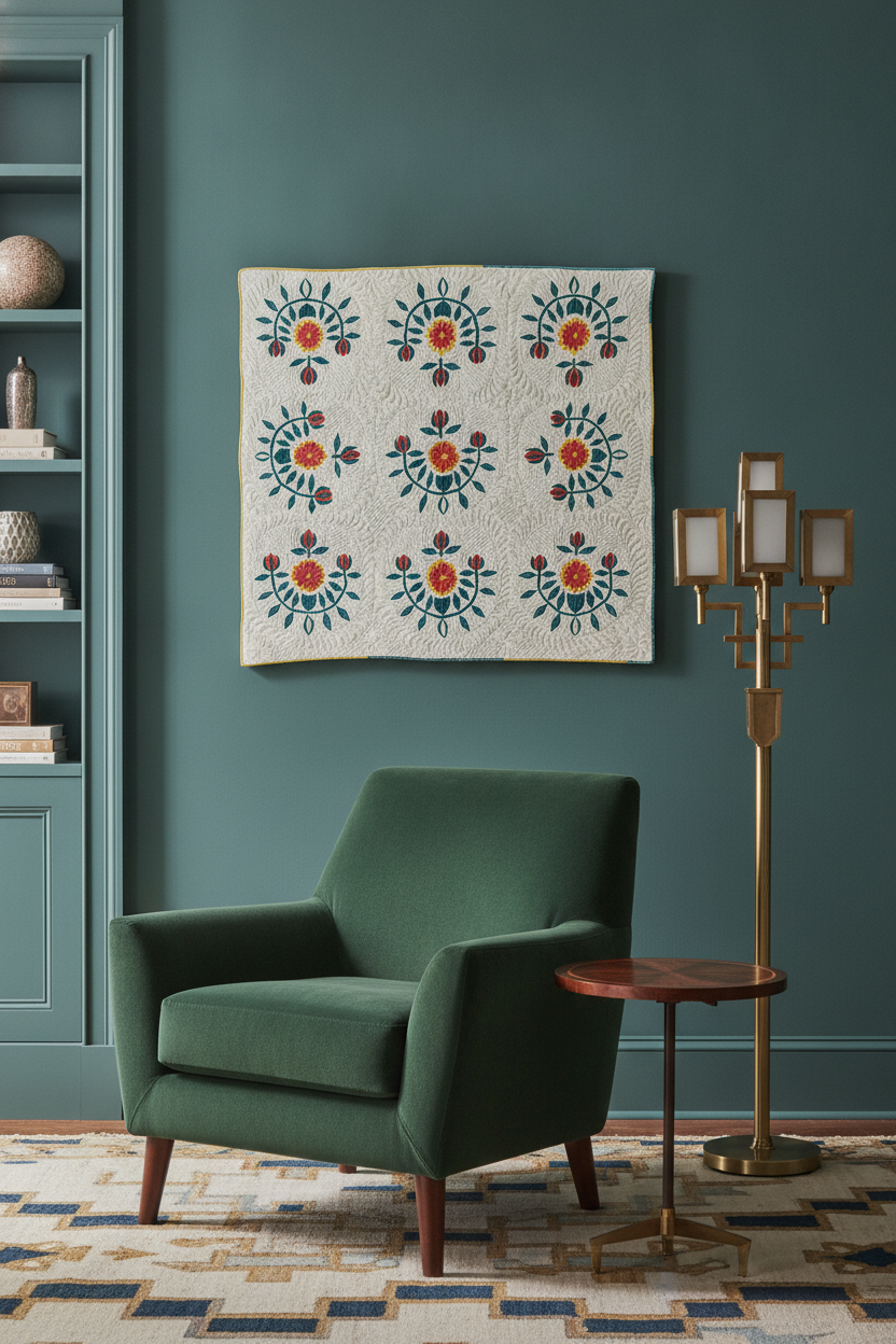
A perfect example of this technical mastery is his rendering of historical American textiles, such as the Cotton Quilt - Tulip Design from around 1938. Created as part of a landmark effort to document early American craft, this piece showcases Gutting's ability to render texture with astonishing accuracy. Every stitch, seam, and subtle fold of the fabric is captured with such precision that you can almost feel the weight of the cotton. Through his brush, a humble piece of folk art is elevated into a monument of classical design.
Why Classical Realism Belongs in the Modern Home
Modern interiors often thrive on clean lines, open spaces, and mindful curation. This is precisely why Gutting's work translates so beautifully onto the walls of a contemporary home. His compositions are built upon a foundation of structural clarity, meaning they bring a sense of organization and calm to any room they inhabit.
Whether displayed as a framed fine-art print or a textured canvas, his pieces bring an organic warmth and a sense of history to a space. The neutral tones and quiet subject matter complement both minimalist and traditional decor, acting as a visual anchor. To explore more of his peaceful, structured works, you can browse the Full Frank Gutting collection to find a piece that speaks to your own sense of home.
Frequently asked questions
What art movement does Frank Gutting's work belong to?
Frank Gutting's style is deeply rooted in classical realism and academic art. During the late 1930s, he contributed to the Index of American Design, a federal project aimed at documenting historical American folk and decorative arts with extraordinary, lifelike precision.
What medium did Gutting primarily use for his design illustrations?
Like many artists working for the Index of American Design, Gutting primarily used watercolor, gouache, and pen and ink to achieve the incredibly fine detail, soft tonal transitions, and realistic textures characteristic of his work.
How do I style a Frank Gutting print in my home?
Because of their neutral palettes and balanced compositions, Gutting's prints work exceptionally well in spaces meant for relaxation or focus, such as bedrooms, home offices, or reading nooks. They pair beautifully with natural wood frames and warm, earthy interior tones.