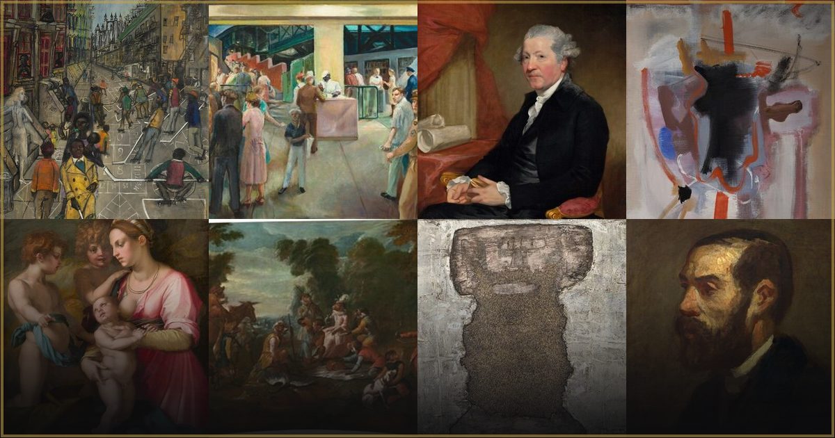
Why does Robert Tardiff's classical art feel so modern?
In short: Robert Tardiff’s art offers a serene escape from modern chaos through classical symmetry, meticulous brushwork, and a grounding, earth-toned palette.
The Appeal of Quiet Order
In the mid-20th century, while the art world was hurtling toward abstraction and loud, chaotic self-expression, Robert Tardiff chose a different path. He looked backward to leap forward, anchoring his vision in the enduring traditions of Classical art. But why does his work still feel so remarkably modern to us today?
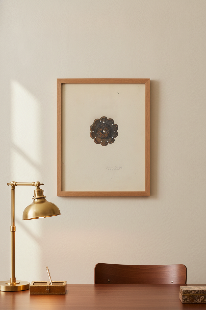
The answer lies in our collective craving for quiet. Tardiff’s art acts as a visual sanctuary. By prioritizing balance, symmetry, and structural harmony, he created compositions that feel incredibly stable and calming. His famous architectural study, "Rosette" (1938), exemplifies this approach, turning a classical motif into a timeless exploration of form and shadow. In an era of constant digital noise, this devotion to order feels fresh, deliberate, and deeply comforting.
The Anatomy of His Style
To understand Tardiff is to appreciate the academic masters who came before him. His work is rooted in a profound dedication to the idealized beauty of the natural and built world. Instead of chasing fleeting trends of the mid-20th century, Tardiff focused on the fundamentals: meticulous brushwork, precise geometry, and a sophisticated, earth-toned palette. This dedication to craft over novelty is precisely what gives his work its enduring power.
When you look closely at his pieces, you will notice a masterclass in light and shadow. He uses soft, directional light to carve out shapes, giving his subjects a three-dimensional weight and presence. His color choices—deep umbers, warm ochres, muted sienna, and soft creams—evoke a sense of archival permanence. There are no jarring pigments here; instead, his colors feel as though they were harvested directly from the clay and stone of classical antiquity, lending each piece a quiet, poetic reverence.
Bringing Classical Restraint Home
Because of their muted tones and structured elegance, Tardiff’s works make exceptional additions to modern living spaces. In contemporary interior design, we often struggle to balance clean minimalism with warmth. Tardiff's compositions solve this dilemma by bringing an instant sense of grounding and history to a room without adding clutter. Whether displayed as a textured canvas above a fireplace or a framed fine-art print in a quiet study, his art anchors the eye.
These pieces pair beautifully with natural materials like white oak, polished stone, and linen, bridging the gap between historical grandeur and contemporary simplicity. If you are looking to introduce a sense of classical grace and timeless aesthetic restraint into your home, exploring the full Robert Tardiff collection is a perfect place to start. Each print serves as a serene window into a world governed by harmony, offering a daily invitation to slow down and appreciate the beauty of quiet contemplation.
Frequently asked questions
What art movement does Robert Tardiff belong to?
Robert Tardiff’s work is deeply rooted in the Classical and Academic traditions, focusing on balance, symmetry, and idealized beauty, even while working in the 20th century.
What color palette is characteristic of Tardiff's work?
Tardiff is known for a sophisticated, earth-toned palette featuring deep umbers, warm ochres, muted siennas, and soft creams, which evoke a sense of archival permanence and natural harmony.
How do Tardiff's prints fit into modern interior design?
Thanks to their clean lines, structural symmetry, and neutral earth tones, Tardiff's works complement modern, minimalist, and transitional interiors, adding a sense of calm and historical depth without overwhelming the space.