Why does the art of Katherine Hastings feel so peaceful?
In short: Katherine Hastings combined classical discipline with soft, luminous glazes to create quiet, balanced compositions that bring a sense of timeless serenity and order to any space.
The Quest for Quiet Order
Why does looking at a Katherine Hastings painting feel like taking a deep, quiet breath? The answer lies in her devotion to the classical tradition. In a world of fleeting trends, Hastings anchored her work in the enduring principles of harmony, balance, and refined draftsmanship. By drawing inspiration from academic masters, she prioritized structural clarity and a quiet, intellectual order over modern abstraction. Her art does not shout for attention; instead, it invites you into a space of timeless serenity. She believed that a well-constructed image could soothe the mind, using precise lines and careful geometry to construct scenes that feel both incredibly stable and deeply poetic.
The Magic of Muted Tones and Soft Light
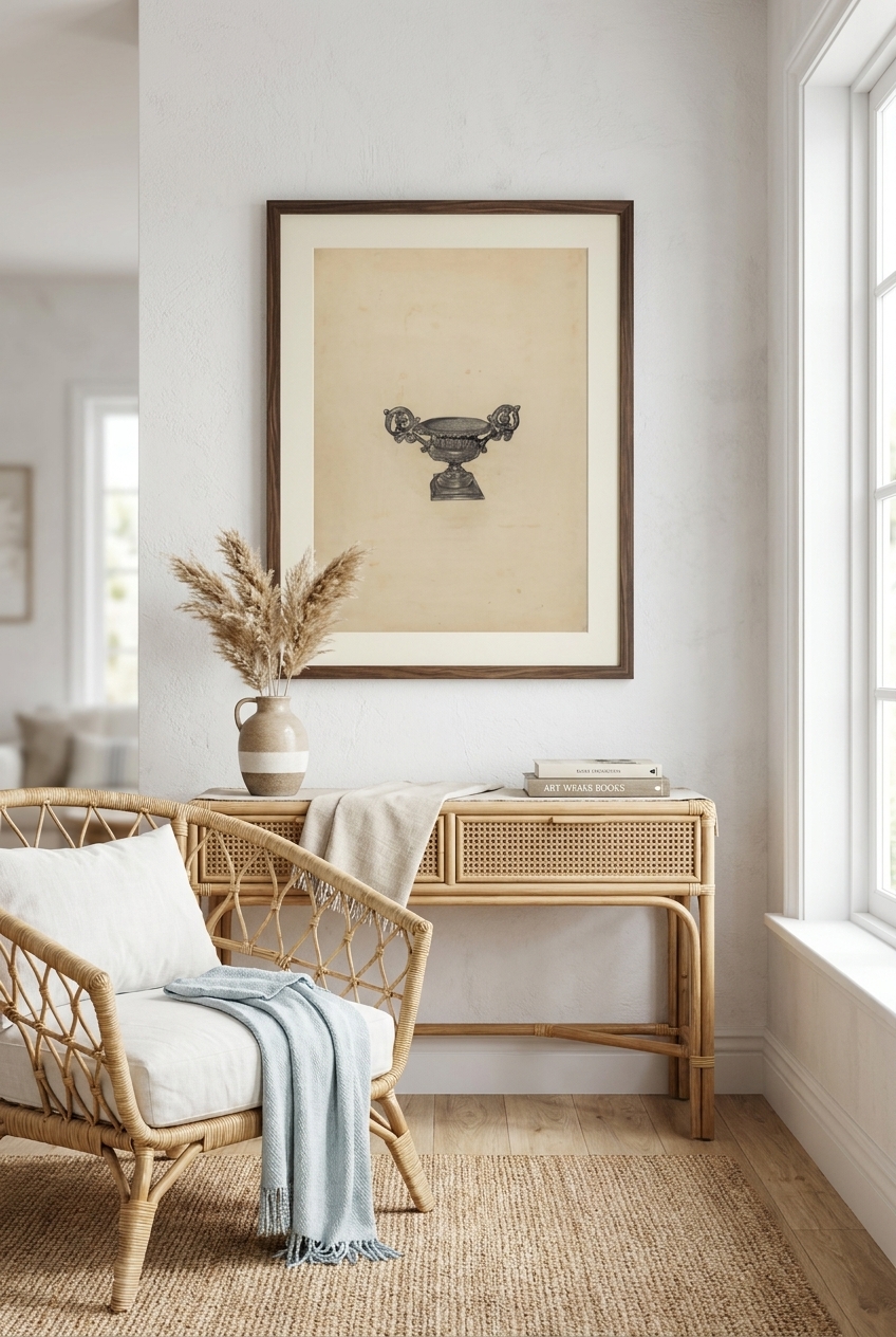
The stylistic signature of Hastings is her delicate interplay of light and shadow. She achieved this not with dramatic, high-contrast clashes, but through a restrained palette of muted earth tones and soft, luminous glazes. This careful layering gives her subjects a gentle glow, as if lit from within. Whether capturing a simple household object or a grander form, her authoritative yet deeply sensitive touch brings out the poetic stillness of the everyday. You can see this exquisite restraint in works like her "Urn for Flowers" (c. 1938), where a simple vessel becomes a study in elegant proportion and quiet light. The soft shadows wrap around the curves of the urn, creating a tactile depth that feels almost real enough to touch.
Finding Beauty in the Everyday
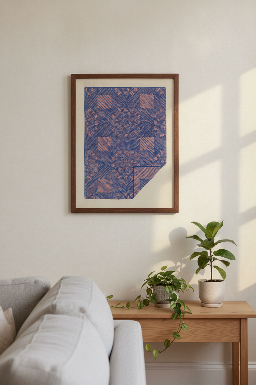
Hastings had a rare gift for finding the monumental in the mundane. She took everyday subjects and elevated them through rigorous classical structure. Her compositions are never cluttered; every line and shadow has a purpose. For instance, in her rendering of textile patterns, such as the "Piece of a Coverlet - Cobalt Blue & Rose" (c. 1936), she balances intricate detail with a sense of broad, clean form. This ability to find harmony in both the simple and the complex is what makes her work so enduringly fascinating to study. She reminds us that beauty is not found in novelty, but in the careful observation of the world around us.
Why Classical Art Belongs in the Modern Home
Modern interiors often crave a sense of grounding. Our lives are fast-paced, and our walls should offer a visual sanctuary. The clean lines and soothing earth tones of Hastings' work make her pieces incredibly versatile for contemporary spaces. A high-quality canvas or framed print from the Full Katherine Hastings collection brings an instant sense of architectural stability and calm to a living room, study, or bedroom. Because her style avoids loud, jarring colors, these prints harmonize beautifully with natural wood, minimalist furniture, and soft textiles, proving that true classical balance never goes out of style. They act as quiet anchors, bringing a touch of museum-quality history into the modern home.
Frequently asked questions
What is the classical art tradition that Katherine Hastings followed?
Hastings drew inspiration from academic masters, focusing on structural clarity, balanced composition, and precise draftsmanship. This tradition values timeless order and harmony over temporary artistic trends.
How did Hastings achieve the soft, glowing effect in her work?
She used a restrained palette of muted earth tones combined with soft, luminous glazes. This technique allows light to gently interact with shadows, creating a quiet, atmospheric glow.
Why do Katherine Hastings prints look good in modern minimalist spaces?
Her work relies on clean lines, balanced compositions, and earthy, neutral colors. This understated elegance prevents the art from overwhelming a room, instead adding a grounding sense of peace and sophistication.