
Willem Kalf: The Master of Velvet Shadows and Quiet Luxury
In short: Willem Kalf elevated the ornate Dutch still life by focusing on dramatic light, rich textures, and a small, exquisite selection of luxury objects emerging from deep, velvety shadows.
The Master of Quiet Drama
In the bustling art market of seventeenth-century Amsterdam, still life paintings were incredibly popular. Wealthy merchants wanted to display their success, and artists obliged by painting tables overflowing with exotic fruits, imported porcelain, and heavy silver. But while many of his contemporaries favored chaotic abundance, Willem Kalf chose a different path. He became the undisputed master of the pronkstilleven—the ornate still life—by doing something revolutionary: he practiced restraint.
Kalf did not crowd his canvases. Instead, he curated his compositions like a modern gallery director, selecting only a few exquisite items to feature. Under his brush, a simple gathering of objects became a profound study of light, texture, and atmosphere. Today, exploring the Willem Kalf collection reveals an artist who was less interested in showing off wealth and far more interested in how light plays across the surface of the world.
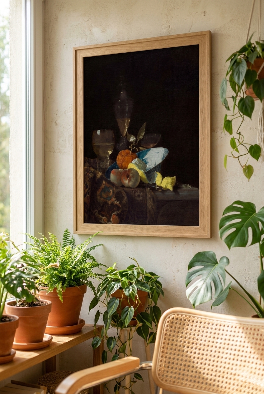
The Anatomy of a Kalf Masterpiece
When you look at a painting by Kalf, your eyes are immediately drawn to the textures. He had an almost miraculous ability to capture the physical essence of different materials. In his famous Still Life (c. 1660), you can almost feel the cool, damp luster of the half-peeled lemon, its rind spiraling down the edge of a table. Nearby, the glittering refraction of Venetian glassware catches the light, contrasting with the cool, heavy sheen of chased silver and the rough weave of a Turkish carpet.
Kalf achieved these effects through delicate, jewel-like brushwork. He applied paint with a precision that allowed him to mimic how light behaves when it hits different surfaces. A silver platter does not just look grey; it reflects the warm glow of an unseen candle. A glass of white wine is not just yellow; it holds a tiny, trapped universe of golden light.
Chiaroscuro and the Power of Shadow
The secret weapon in Kalf’s artistic arsenal was his mastery of chiaroscuro—the dramatic contrast between light and dark. Kalf did not paint bright, evenly lit rooms. Instead, he plunged his backgrounds into deep, velvety shadows. Out of this rich darkness, his subjects emerge like actors stepping into a single, dramatic spotlight.
This technique does more than just look beautiful; it creates a sense of intimacy and mystery. By whispering rather than shouting, Kalf invites us to slow down and look closer. The dark spaces in his paintings give the eye a place to rest, making the illuminated objects feel incredibly precious and rare.
Why Kalf’s Work Belongs in the Modern Home
While these paintings were created over three centuries ago, they possess a timeless aesthetic that fits beautifully into contemporary interiors. Modern home design often leans toward clean lines and minimalist spaces, which can sometimes feel a bit cold. A high-quality print or canvas of a Kalf masterpiece introduces instant warmth, depth, and soul to a room.
Because Kalf’s compositions are so focused and uncluttered, they do not overwhelm a space. Instead, their rich, dark backgrounds and glowing highlights create a sophisticated focal point. Whether hung in a sunlit dining room or a cozy, moody study, Kalf’s quiet meditations on light and shadow bring a touch of classical mystery and effortless elegance to the modern wall.
Frequently asked questions
What does the term "pronkstilleven" mean?
Pronkstilleven is a Dutch word that translates to "ostentatious" or "ornate" still life. It refers to a genre of painting that showcased luxury goods, exotic fruits, and expensive tableware to reflect the wealth and global trade reach of the Dutch Republic.
Why did Willem Kalf paint peeled lemons so often?
The peeled lemon was a favorite motif for Kalf because of the technical challenge it presented. It allowed him to demonstrate his mastery of texture by contrasting the matte, bumpy outer rind with the glistening, wet flesh of the cut fruit, while also adding a vibrant splash of yellow to his dark color palette.
How does Kalf's style differ from other Dutch Golden Age still life artists?
While many artists of the period filled their canvases with a chaotic abundance of items, Kalf was known for his restraint. He focused on a very small selection of luxury items, using dramatic spotlighting (chiaroscuro) and deep shadows to create a quiet, intimate, and mysterious atmosphere.